Editor: Porcia Akua Holmes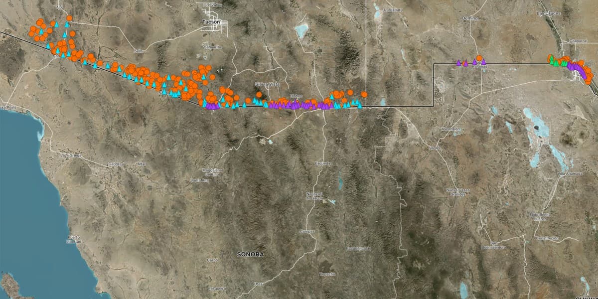
A 15-month investigation has produced the first comprehensive map correlating migrant deaths with the locations of government surveillance towers along the US-Mexico border. The map reveals a stark disconnect between the technology's purpose and its real-world outcomes. Our analysis shows that deaths occur frequently even in areas with heavy monitoring, raising serious questions about the effectiveness of a surveillance-first border strategy.
The Investigation's Scope
The team examined cases dating back to 2015, covering multiple presidential administrations and tower technologies. Researchers analyzed more than 2,000 deaths, cross-referencing locations with the installation timeline of surveillance towers. The dataset merged existing records from organizations including No More Deaths, Humane Borders, and the Electronic Frontier Foundation with new records obtained from over a dozen agencies. The biggest data gap existed in Texas, where counties keep fragmented records and where justices of the peace often lack resources to document death scenes properly.
Key Findings From the Map
Why This Matters
This map directly challenges the rationale for investing billions in the 'virtual wall.' If surveillance technology cannot prevent deaths, policymakers must reconsider spending priorities. But the implications go deeper. The map provides humanitarian groups with concrete evidence to advocate for alternative approaches such as water stations and rescue beacons. For border communities, it highlights the human cost of a strategy that prioritizes detection over deterrence. Some agency officials argue that without towers, the death toll would be even higher. Our data cannot prove that counterfactual, but it shows no correlation between tower density and reduced fatalities. The investigation underscores a fundamental failure: technology designed to save lives by deterring crossings may instead be contributing to a more dangerous migration environment.
How the Map Was Built
The challenge of compiling the death data was enormous. Unlike Arizona, which has a centralized tracking initiative, Texas leaves death investigations to individual counties. Researchers submitted public records requests to 17 Texas counties but faced delays that extended over a year. Some justices of the peace declared deaths over FaceTime without visiting the scene, creating incomplete records. Here's the critical finding: the map does not claim causation but reveals a pattern. When towers went up in one sector, deaths often shifted to adjacent sectors with less coverage. The investigation does not stop at the map. It includes interviews with current and former White House advisors, Border Patrol agents, medical examiners, and tech company employees. The collective testimony paints a picture of a system that measures success by arrests rather than lives saved. The map is a tool for accountability, not a final answer.