Editor: Porcia Akua Holmes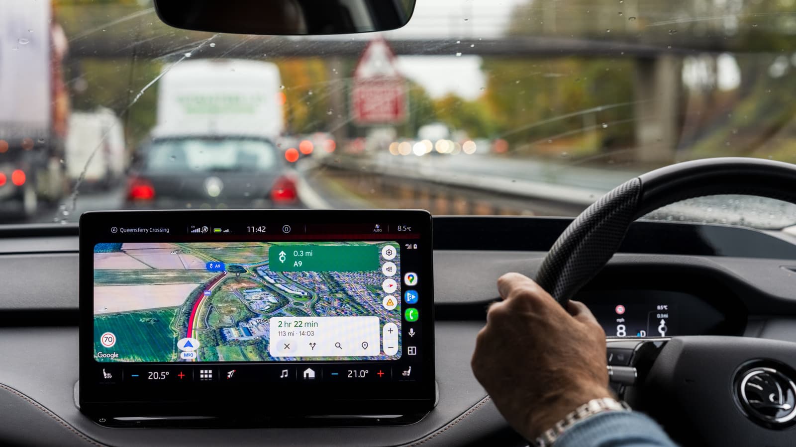
The estimated time of arrival on Google Maps is not just a static number. A subtle color shift in the display reveals real-time traffic conditions, helping drivers anticipate delays before they happen. The feature uses green, orange and red to communicate road congestion at a glance.
Color Meanings for Navigation
The common question "Why does the ETA time on Google Maps change color?" has a straightforward answer. Google designed the interface to match traffic severity with a familiar traffic light palette. Each color corresponds to a specific level of delay:
Behind the Color: Data and Algorithms
Google Maps does not rely solely on static maps. The application processes anonymous location data from millions of devices alongside historical traffic patterns. Machine learning models predict how congestion will evolve during the journey, adjusting the ETA and its color in real time. This predictive capability distinguishes Google Maps from simpler mapping tools that only show current conditions without forecasting changes.
The color change mechanism, while simple in appearance, involves complex backend calculations. Google factors in road type, time of day and known events such as construction or accidents. The result is a color that updates continuously as the driver moves, offering an immediate visual cue without requiring the user to tap or scroll.
Why This Matters
For everyday drivers, the color of the ETA directly influences trip planning and stress levels. Seeing red before a commute may prompt a user to reroute or delay departure by a few minutes. The feature also encourages safer driving by reducing the need to check detailed traffic maps while moving. From a broader perspective, Google Maps color coding represents a shift toward glanceable, action-oriented interfaces in consumer navigation.
This design choice has real-world economic implications. Businesses that rely on timely deliveries or appointments can integrate Google Maps data to improve scheduling. Municipal traffic management systems could use aggregated anonymized trends to predict bottlenecks. The color change is not just a cosmetic update; it is a functional tool that scales across millions of daily trips.
What You Need to Know
Google Maps changes the ETA color to provide an immediate traffic status without opening additional menus. Green means normal conditions, orange indicates moderate delays and red signals heavy congestion. The system refreshes automatically as traffic data changes. Understanding these colors can save time and reduce frustration during navigation.